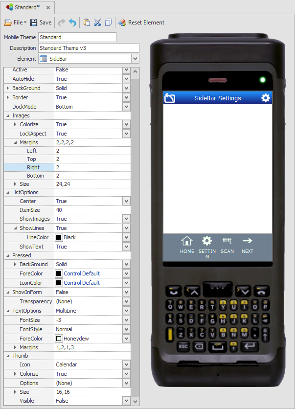
Themes: SideBar

Example : Grey SideBar (MenuStrip) at base of screen.
This sets the device SideBar menu appearance and the SideBar Thumb (extended area) appearance. which can be added and customized for your application so the user may have access to additional system functions such as scanning, access to a soft keyboard, mobile profile settings in the client device.
Refer to the Graphical UI Control Definitions for information on properties.
Refer to the topic How to create a SideBar for details on adding or customizing the SideBar for specific applications.
Note that the selection of default icons for these are sourced from Configuration > SideBar and Key Settings > SideBar Default Configuration. They can also be sourced from a specific application if configured properly.
SideBar Theme Properties
Active - Displays the SideBar in the form at design time and runtime when Active is set to True. If set to False, it does not display automatically. All keyboard input and mouse operations on objects outside the sidebar will now invoke the auto-hide logic.
AutoHide + Active - When AutoHide and Active are both True, the SideBar will be visible at login. It remains visible until you hide it via script or a button with "Action = Show/Hide SideBar."
AutoHide + NonActive - When AutoHide is False and Active is True, the SideBar stays hidden until your script or action request causes it to be shown. Then the SideBar will close after the user clicks on it or there's an interaction with another control/object.
NonAutoHide + NonActive - When AutoHide and Active are both False, the SideBar will initially hide and will remain in the state you selected until a show or hide action is requested or scripted.
Background - Stylizes the background color of the sidebar.
Border, BorderColor - the color of the border.
DockMode - Stations the SideBar to the Top, Left, Right, or Bottom of screen.
Images - This property group sets the look and scale aspect of the icon(s) used in the SideBar. These properties are the same as defined in Graphical Control Definitions.
ListOptions, Center - If True, this will center the icons and override SideBar Default Configuration Column value. If Center=False, the SideBar Default Configuration Column value is used.
ListOptions, ItemSize - Sizes the icons as one group in pixels.
ListOptions, ShowImages - If True, displays the icon on the SideBar and False will not display the icons. (Do not confuse icon presentation with "Thumb" below.) These values override the SideBar Default Configuration Visibility setting.
ListOptions, ShowLines - Will display lines between icons.
ListOptions, ShowText - If True, will show the caption text for the icon; False hides it.
Pressed - Controls how the icon looks when pressed.
ShowInForm - This function is now superceded by the values set in Active and AutoHide. it is no longer used. The ShowInForm, Transparency is superceded by the icon Colorize property.
TextOptions - The FontSize, FontStyle, ForeColor, and Margins behave the same as described in the Graphics Control Definitions.
Thumb,Visible - If Visible is True, the SideBar area is extended to allow the placement of more icons. If Thumb, Visible is False the extended area remains hidden.
Thumb, Icon - sets which icon(s) are placed on the Thumb. If Icon = (Custom)-- is for the icons you add from the Name drop down list. IF Thumb,Icon is not Custom, select any icon from the Icon list.
Thumb, Colorize - True will colorize the icon for the selected color; False will use the icon's original color.
Thumb, Options - Keep as (None) unless there is a need to orient the icon in a different position (i.e for landscape display).
Thumb, Size - Sets the set of icons size in pixels.